Learning D3.js by Building a Chart
If you’re doing any JavaScript you’ve probably heard of d3.js. In fact Github Graphs are built with it so even if you weren’t aware, I’m sure you’ve seen it there. But maybe you haven’t been sure how to get started using it yourself. Its not too hard once you have a mental model of how it works.
Today we’re going to walk through how to build a bar chart that shows some interesting weather data about Boston as a way to learn more about d3.js.
Before we get into any details here are a few big picture ideas to keep in mind
- d3 is all about binding data with DOM elements.
- d3 has an enormous API covering charts, maps, arrays, and all sorts of other things
- svg is a great fit when you’re creating charts or other visualizations
Binding data to the DOM
The first thing to know is that d3 stands for Data-Driven Documents and its core job is to let you synchronize data to DOM elements.
Let’s start by seeing how we can use it to add some DOM elements.
1
<script src="http://d3js.org/d3.v3.min.js"></script>
Once we include the d3.js script in our page, we have a top level d3 object we can use to start adding elements.
If you haven’t used SVG (scalable vector graphics) its a series of tags added in HTML5 that let us define shapes on our page.
They can be styled with css and manipulated with javascript just like traditional html tags but are designed more for shapes than text so we can do all sorts of interesting drawings with them.
1
2
3
4
var svg = d3.select('body').append('svg')
.attr('height', '200')
.attr('width', '500');
var g = svg.append('g');
This looks kinda like jQuery but with a slightly different syntax and that’s not by accident. Let’s go through it line-by-line
- Line 1 - We append a new
svgelement inside thebodyand return a d3 object representing that element. - Line 2-3 - D3 chains everything just like jQuery so we can set
heightandwidthattributes on the svg element - Line 4 - Add a
g(or “group”) element within the svg
The page won’t look any different to a user because the svg and g elements don’t have any visual representation, however, if we were to inspect the DOM we’d see our tags in there
1
2
3
4
5
<body>
<svg height="200" width="500">
<g></g>
</svg>
</body>
We’re started on the document part so time to add the data. Here’s a simple tsv (tab-separated values) file of average snow totals in Boston by month (all the data files are on github if you want to look).
Month  Average
Oct    0.1
Nov    0.6
Dec    12
Jan    14.9
Feb    11.8
Mar    7
Apr    0.3
Now we will use the d3 tsv API for parsing our data and inserting an element for each row into the DOM.
Before we look at the code there are two concepts to mention briefly.
We’re going to create a bunch of rect elements within our svg.
As the name suggests the browser will draw them as rectangles.
Also the main mechanism behind d3 is joining data to the DOM. Basically a dataset is joined to a set of DOM elements and d3 ensures that there will be the same number of DOM elements as rows of data. Mike Bostock has explained this really well in thinking with joins. 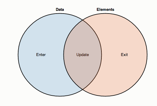
So what does this look like in code?
1
2
3
4
5
6
7
8
9
10
11
12
13
14
15
16
17
18
19
20
21  // This is unchanged
  var svg = d3.select('body').append('svg')
              .attr('height', '200')
              .attr('width', '500');
  var g = svg.append('g');

  var parseRow = function(row) {
    return {
      month: row.Month,
      average: parseFloat(row.Average)
    }
  };

  d3.tsv('data/snow.tsv', parseRow, function(data) {
    var rect = g.selectAll('.bar').data(data)
               .enter().append('rect')
    rect.attr('class', 'bar')
        .attr('width', 10)
        .attr('height', 100)
        .attr('x', function(d) { return d.month.charCodeAt(0)})
  })
- Line 14 - Load and parse the
snow.tsvfile. We give it 2 callbacks, the first for formatting each row and the last to process the data by adding it to our DOM - Lines 7-12 - Format each row by converting the
averagecolumn from a string to a number - Line 15 - Bind our data to all the elements with the
barclass (it’s an empty set when the page loads but this becomes useful further on) - Line 16 - for each data item without a corresponding DOM element (that’s what
enter()means) create arectelement - Lines 17-20 - set a bunch of positioning attributes on each rect. The attributes can either be a contant or a function that gets called with the data item d3 attached to this particular rect element.
Now we have a bar but they’re all on top of each other (mouse over what’s below to see)
To space the bars out a bit we can change the logic for the x attribute to .attr('x', function(d) { return d.month.charCodeAt(0) * 5 })
but now it’s weirdly in the middle of the page.
Next we will look at some d3 chart APIs that can help us position the bars instead of spacing based on the first letter of each month.
Scaling with the D3 Scale API
What we need to do is scale both the x and y dimensions based on the data we have. The width of each bar depends on how many months we are displaying and also the height depends on the height of the month with the most snow. Luckily d3 has us covered with its scales API. We’re going to use an ordinal scale for the months and linear scale for the inches of snow.
We change the tsv callback to use these scales when setting the width, height, x & y attributes of each rect.
1
2
3
4
5
6
7
8
9
10
11
12
13
14
15
16
17
18  d3.tsv('data/snow.tsv', parseRow, function(data) {
    var months = data.map(function(d) { return d.month })
    var x = d3.scale.ordinal()
            .rangeRoundBands([0, 400], .1)
            .domain(months)

    var averages = data.map(function(d) { return d.average })
    var y = d3.scale.linear()
            .range([150, 0])
            .domain([0, d3.max(averages)])

    var rect = g.selectAll('.bar').data(data).enter().append('rect')
    rect.attr('class', 'bar')
        .attr('width', x.rangeBand())
        .attr('height', function(d) { return 150 - y(d.average)})
        .attr('x', function(d) { return x(d.month) })
        .attr('y', function(d) { return y(d.average) })
  })
Let’s look in detail at how we are scaling the x dimension.
First we do some setup looking at our data as a whole
- Line 2 - Extract the months from our data
- Line 3 - Tell d3 our x dimension will have ordinal values (since we can count and sort but not measure the names of the months).
- Line 4 - We want it to stretch the bars so they go all the way across our svg with some padding between each
- Line 5 - Apply these calculations to the months in our data.
Now set the right x and width on each rectangle.
1. Line 14 - Set each bar to the width based on all the calculations above
2. Line 16 - Use the x to tell us where to place each bar
You can see the same logic applied in the y dimension on lines 6-9 then 15 & 17. The only difference is we’re using a linear scale because “average inches of snow” is a number
Now that’s looking much better! But a bar chart should really label its axes …
Adding Axis labels
You can probably guess that if we need to do axes, there’s a d3 API for axes.
1
2
3
4
5
6
7
8
9
10
11
12
13
14
15
16
17
18
19
20
21
22
23
var g = svg.append('g')
.attr("transform", "translate(40, 0)");
g.append('g')
.attr('class', 'x axis')
.attr('transform', 'translate(0, 150)');
g.append('g')
.attr('class', 'y axis');
d3.tsv('data/snow.tsv', parseRow, function(data) {
// everything that was here before ... then
var xAxis = d3.svg.axis()
.scale(x)
.orient('bottom')
d3.select('.x.axis').call(xAxis)
var yAxis = d3.svg.axis()
.scale(y)
.orient('left')
.tickFormat(d3.format('.0'));
d3.select('.y.axis').call(yAxis)
})
So what have we done?
- Line 2 - we move the
ggroup to the right to make room for the y axis - Line 4-8 - add 2 new
gelements for the 2 axes - Lines 13-16 - create the x axis using the same scale as the rectangles then tell d3 to apply it to the DOM elements we created before
- Lines 18-23 - do the same with the y axis
Now that’s looking pretty good!
Let’s keep experimenting and see how to make it more dynamic.
Loading different data sets
It does more than just snow in Boston, sometimes it rains and its interesting to know how hot or cold it gets. Let’s let people pick what weather statistic they want to look at.
1
2
3
4
5
<select onchange="loadData()" id="metric">
<option >snow</option>
<option >precipitation</option>
<option >temperature</option>
</select>
There’s our simple select box and now for the javascript changes.
1
2
3
4
5
6
7
8
9
10
11
12
13
14
15
var loadData = function() {
var metric = document.getElementById('metric').selectedOptions[0].text;
var dataFile = 'data/' + metric + '.tsv'
d3.tsv(dataFile, parseRow, function(data) {
// .. unchanged code ...
var rect = g.selectAll('.bar').data(data);
rect.enter().append('rect');
rect.exit().remove();
// .. more unchanged code ...
})
}
loadData()
- Line 1 - we wrap the call to
d3.tsvin a newloadDatafunction. - Line 2-4 - pick which data file to load (we cannot hardcode ‘data/snow.tsv’ anymore)
- Lines 7-9 - Remember when we talked about thinking in joins and how d3 binds data to DOM elements? Previously we only had the
enter()line which handles the case when there are more rows of data than DOM elements. Now we need to handle the opposite case when there are more DOM elements than rows of data. In that case we useexit()and delete those elements.
Animating with the d3 transtions API
It’s always fun to have things move around so in our last step we’re going to look at how to rearrange the chart to be in descending order or calendar order. Once again there’s a d3 transition API to help.
We’ll start by adding a UI element
1
<input type=checkbox>Sort</input>
and then add the logic.
1
2
3
4
5
6
7
8
9
10
11
12
13
14
15
16
17
18
19
20
21
22
23
24
25
26
27
28
29
30
31
32
d3.tsv(dataFile, parseRow, function(data) {
// .. all the unchanged code ... then
var monthIndex = function(monthName) {
var months = {
Jan: 1, Feb: 2, Mar: 3, Apr: 4, May: 5, Jun: 6,
Jul: 7, Aug: 8, Sep: 9, Oct: 10, Nov: 11, Dec: 12
};
return months[monthName];
}
d3.select('input').on('change', function() {
var sortByAverage = function(a, b) { return b.average - a.average; };
var sortByMonth = function(a, b) { return d3.ascending(monthIndex(a.month), monthIndex(b.month)); };
var sortedMonths = data.sort(this.checked ? sortByAverage : sortByMonth)
.map(function(d) { return d.month; })
x.domain(sortedMonths)
var transition = svg.transition().duration(750);
var delay = function(d, i) { return i * 50; };
transition.selectAll(".bar")
.delay(delay)
.attr("x", function(d) { return x(d.month); });
transition.select(".x.axis")
.call(xAxis)
.selectAll("g")
.delay(delay);
})
})
- Line 4 - Bind to the change event so this gets called when the sort checkbox changes
- Line 5-9 - Sort the months in the right way and update the x domain
- Line 11-12 - Use the
d3.transitionAPI to tell the duration (750 ms) and make the elements start not all at once. - Line 14-16 - Animate all the rectangles (they have class
.bar) - Line18-21 - Aminate the labels on the x axis
And that brings us to our final working chart.
The d3.js API is immense but very well documented and there are tons of examples to inspire you at the D3.js Gallery. Last of all thanks to Mike Bostock for creating such an awesome library.